THE EVERLOVE - LEVEL UP
---
This was the third album cover I've had the privilege to design for the band, but the first time I've worked directly with them to fine tune artwork while the album was still being finalized. This provided a unique opportunity for the artwork and the music to inform the direction of one another in a way that neither I, nor the band, had ever experienced before - it was pretty amazing, and I think the artwork is stronger for it.
---
---
Several days before I heard a track or saw a lyric sheet I had an informative discussion with Ryan from the band and learned a lot about their ideas for the album and how they considered it a bit of a blend of their edgy rock album Walk Through Fire (2018) and their synth-heavy album The Real Thing (2020).
---
---
As the designer for both of those albums, I was familiar with their soundscapes and immediately got to work ideating on a direction for the new album - this time though, the music would be more energetic with a bit more bite and a darker sound.
--
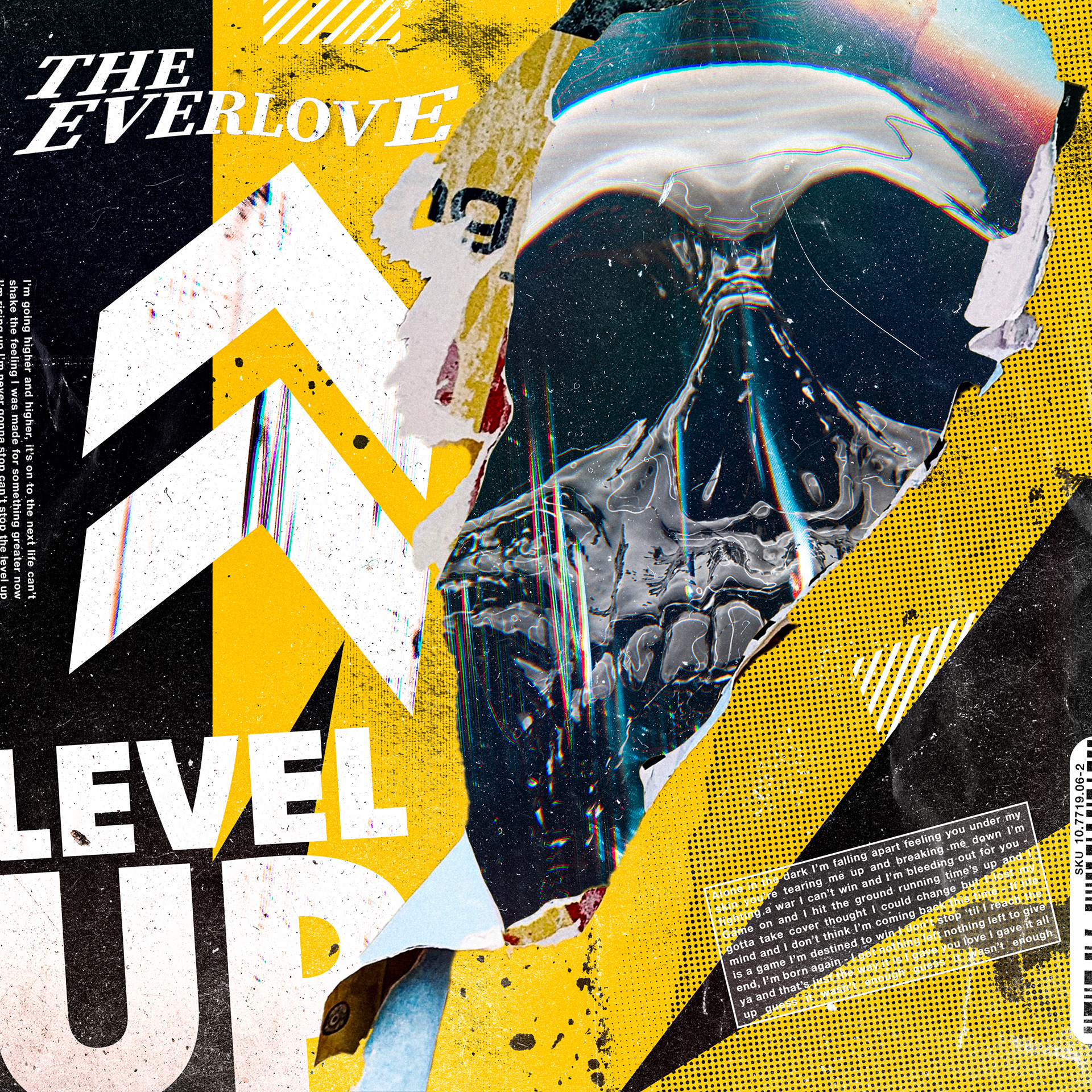
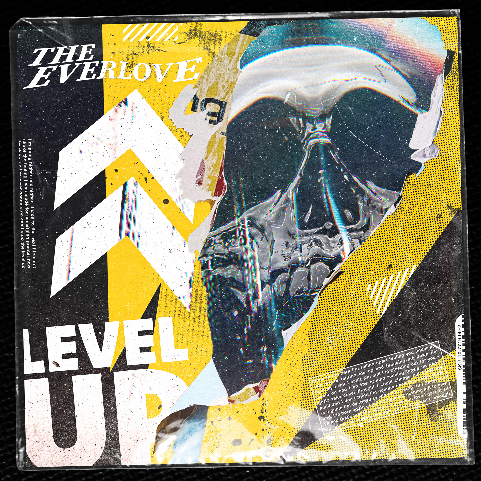
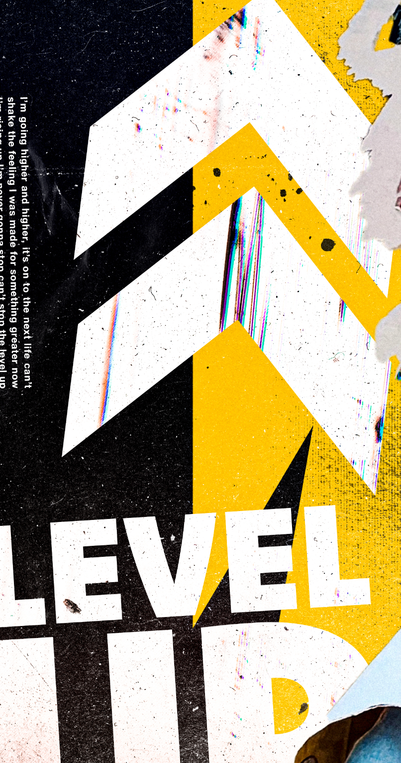
The prominence of the album title text "Level Up" and the two arrows pointing up were a part of the initial design sketches and one of the first elements to get locked in as part of the design's layout.
(The band's track "I'm Dangerous", from Walk Through Fire, has a huge gamer fanbase and I wanted to give a nod to that with the suggestion of a "level up" indicator that one might find in a video game.)
--
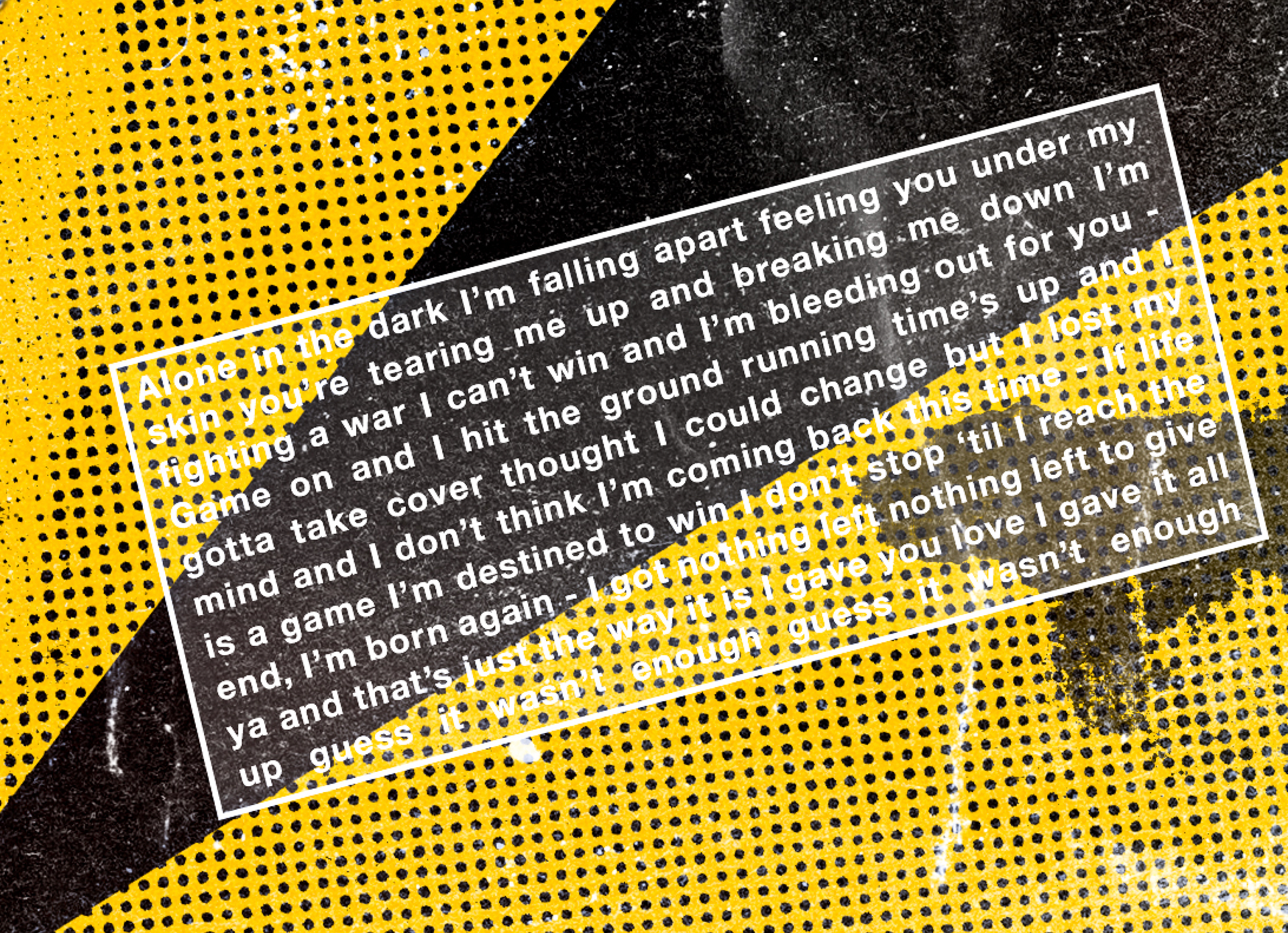
Another part of the design that was present from the earliest sketches was the use of a skull - which seemed to fit naturally with lyrics like "...it's on to the next life..." and "...alone in the dark, I'm falling apart - feeling you under my skin..." and "...you're never coming back, never coming back...". It took a while to find the right skull image that came close to my initial sketch but I finally came across something in Adobe Stock and used a variety of textures and distortion layers to turn into what you see in the final design.
---

---
One of my favorite design trends over the past year or two has been seeing designers bring the physical world into the realm of the digital with the use of plastic bags, cd cases, cassette tapes, and other physical materials in modern designs.
--
(Kanye West's Yeezus and Bring Me the Horizon's amo are two of my favorite examples of this trend - as well two of the earliest examples I remember taking note of.)
--
I hadn't considered this direction at first, but after one of the guys in the band suggested a couple of changes to the initial comp, so it seemed like a good solution to experiment with that style on this album - in the end, I think it works quite nicely.
--
See below to learn what the design looked before the plastic bag overlay was placed over top of it.
---